Dime
Dime is an Indian fin-edu platform making financial literacy accessible for younger audiences. The brief was simple: build a digital home that feels credible without being corporate.
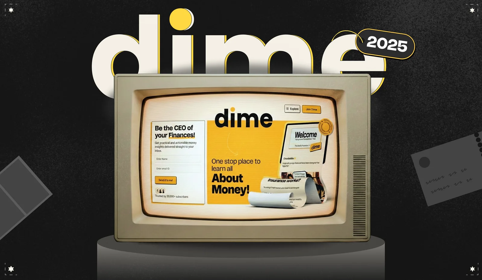

Financial services converge on the same visual system: cool blues, high-contrast neutrals, geometric sans, data as ornament. It's a risk-aversion signal borrowed from institutional banking, and it works — on people who already trust institutions. Dime's audience doesn't. They're 22, learning money from Instagram, and the navy-blue register reads as the language of the thing that has historically confused them. The brand had to earn credibility from a different direction.
The system
How it holds together

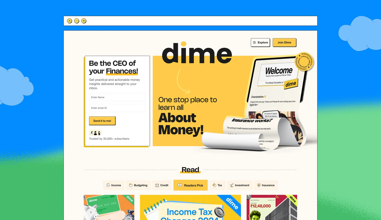
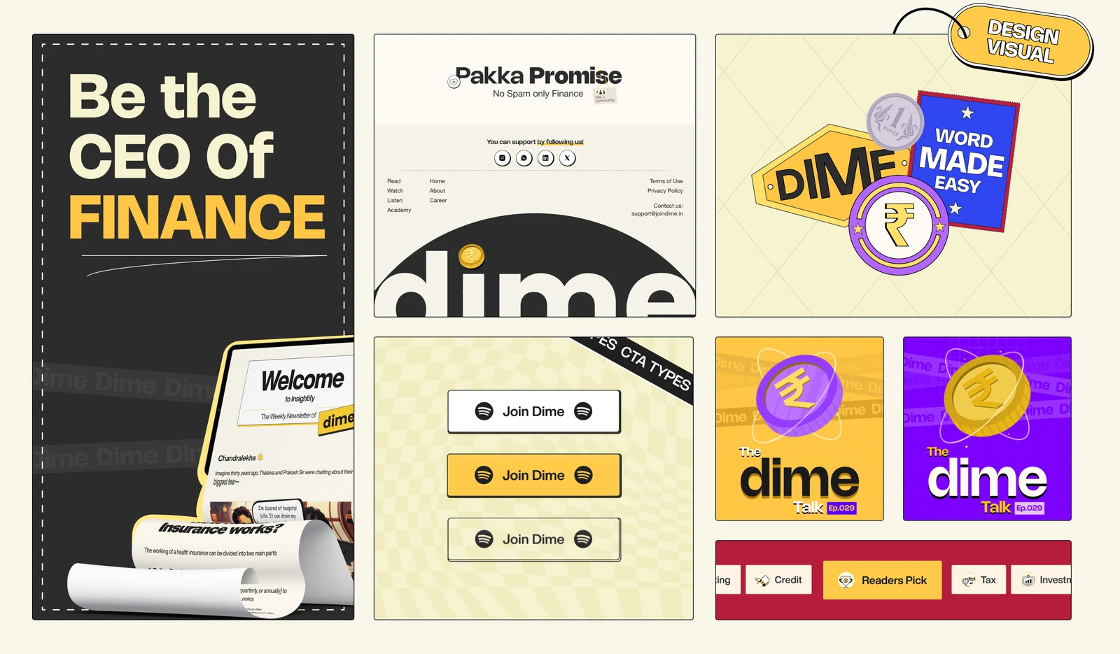
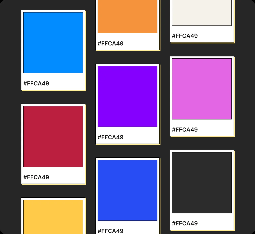
Yellow carries the primary load, the only high-visibility hue that reads optimistic rather than urgent. Purple, cobalt and coral are scoped to illustration and content categories; they never enter the UI layer. That boundary is what stops a loud palette becoming noise as content scales. Stickers, badges, retro-TV frames and halftone textures aren't decoration, each is a defined container. TV frame for featured and course content, badge for status and dating, texture for section breaks.

Oorja and Noor were unbelievably good! Today our website is what it is and how it looks and feels is cause of them!!
Chandralekha
Founder, Dime